Website Design Critique 2
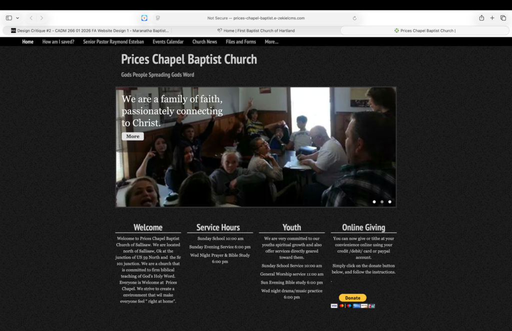
Prices Chapel Baptist Church is my example of a website that could use some improvements, or at a minimum add the address of the church to the website. The overall design of the website is rather bland to say the least. Someone clearly likes black and white because those are the only two colors on the website except for the donation button. Much of the key information is on the homepage and while it is categorized, there is a lot of information clumped together adding more confusion. Many of the pages have odd, large, empty spaces giving the impression that something is missing.
The navigation of the website is relatively self-explanatory. The organization does seem rather random. Fining information is not the clearest in part because there is not a tone of information on the website. Basic information is on the main page and other information can be found on the menu bar. It is easy to find basic information, but other information can be harder to find or is non-existent.
Most of the links on the website appear to function as intended. There are a few pictures that change on the main page that show properly however, two of them have a “more” button that does not do anything. Other thana that the rest of the website works well.
The content of the website is less than par. Each page has multiple font styles. The main page of the website has a large picture drawing your attention, but it does not give much information. The information of the website is not very helpful. Every page has a place to get in contact with the church and one of the pages has the contact box twice which is a bit repetitive. The senior pastor page leads you to a page to message the church rather than giving information of the pastor. The website does have a page with church pictures, and all the pictures are very low quality.
The overall effectiveness of the website is rather minial due to the overall lack of information. If you are looking for the church address you are out of luck. If you want to see what they have upcoming you are out of luck because their calendar is blank. However, if you want to get in contact with the church, you are at the right place because the contact portal is on the website twenty times. The website is not persuasive to someone looking for a church. Additionally, the website gives no critical information of the church such as doctrinal statements or statements of faith. So, to sum things up, the effectiveness of the website is very poor.
http://prices-chapel-baptist.e-zekielcms.com/church-news#
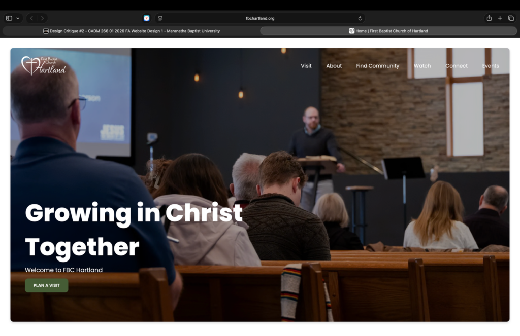
First Baptist Church of Hartland is my example of a well-designed website. The overall design of the website is a lot at first however it is very colorful, informative, and welcoming. The website does not have one specific thing that draws your attention except for the massive photos. The logo and church name is nicely displayed, and the rotating photos keep you engaged. The overall navigation of the website while not my favorite, is done well.
The navigation of the website is for the most part fairly simple. The menu bar makes it easy to find basic information about the church such as location, service times, activities, and programs. While the main page does have a lot of information, the pictures categories make it easier to find information.
Th website appears to function great. It has a lot of links all of which to appear to work properly. The website also has a lot of media and images, none of which appear to have any issues. It is easy to navigate between pages, and everything loads quickly.
The content quality is excellent. The images and graphics are excellent. They are informative and engaging. The images are cheerful, leaving viewers pleased with their interaction with the website. All the information a visitor may look for I easily accessible via the menu bar or the main page. Th color schemes match the message of the content well.
The overall effectiveness of the website is excellent. The website is much better than most Baptist church website I have seen. The sit is friendly, informative, and inviting, making site visitors intrigued and exited to visit the church. The website message is clear and direct letting visitors know exactly what the church is about and exactly what someone can expect if they are to visit the church.