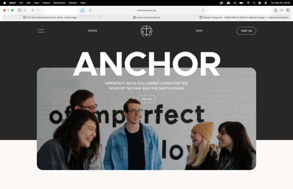
The Drive Methodist church is my example of a poorly designed website. The overall design is very outdated in style. The content appears to be up to date and according to the website, it was updated September 20th, 2026. The color schemes are outdated and clash. Upon initial interaction with the website, the amount of information is almost overwhelming. There is some organization, but all the links appear at first glance.
The main links are all on one side of the page and do have some layers to the organization however the placement on the website does cause a bit of an information overload. Creating deeper layers of organization or drop down tabs could help to streamline things and make information easier to find while avoiding overstimulating website visitors.
The navigations of the website is once again rather complicated. There are many links all leading to random things. At first glace there is no structure making it confusing to navigate. Links placed all around the webpage leave you unsure where to look for information. Most of the links appear to function as intended however the pages they lead to are also outdated or unorganized. Many of the links lead to pages with no aesthetics and are entirely lists of random files, names and numbers.
As stated before, the content of the website is quite outdated. The fount styles and shadows are old and not appealing. The website does contain a lot of helpful information however much of it is added to the website in its raw form, being files or random charts with loads of information. While there is extensive information, the quality is quite poor.
Given the poor quality and content of the website, the effectiveness of the sight is minimal. The website appears to be more for the purpose of giving members information of the church and other member, rather than to present the church to people who have never visited before. Seeing how the website did not increase my interest in the church, I would say the effectiveness of the website is incredibly poor.
https://www.drive-methodist.church/index.php
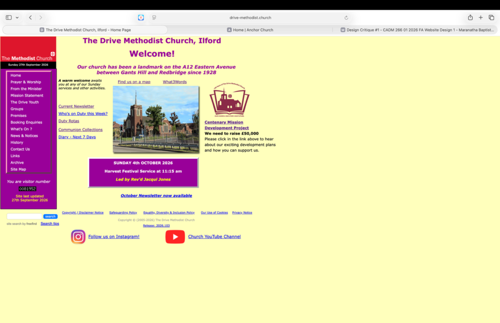
Anchor Lincoln is my example of a well-designed website. Right off the bat the website appears to be new and up to date. There are lots of moving part and visuals to catch your eye. The website includes basic information on the first page and has more extensive information on other pages. While the visuals are eye catching, there are a lot and may even be too much. The overall design of the website is modern and engaging keeping visitors interested in the website.
The navigation of the website is quite organized however there is a lot of information. There appears to be three church locations using one website which does intern bring more information. The website has multiple drop-down menus helping to make information easier to find. Additionally, you can scroll through the main page of the website to find more information.
All the links, images, and animations appear to be functioning properly. Many of the sites can be reached by clicking an image, logo, or other wording rather than only clicking “click here.” The site includes multiple drop-down menus which organize a wealth of information very well. Some of the menus are different pages that can be scrolled through rather than a drop down menu.
The content of the website is excellent. The font matches the style of the website and is consistent across the whole website. The image are all very natural and appear to be actual images of the churches. The initial image that pops up is a little pixilated. The content of the. Website is very informative and professional.
The overall effectiveness of the website is quite good. It is friendly, informative, and inviting. Each area that the website talks about (such as various ministries and opportunities) is informative and includes visuals to help increase knowledge of the church.